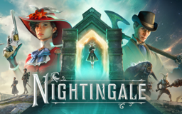

Some Feedback and Opinions About what I've seen so far having played for about an hour. (Planning on playing more).
UI/UX:
(11/16/2024) The Bottom UI in dialogue is a little awkward (not bad). It may either be because all the options are spaced across the screen or that the button symbols (for controller) are an awkward distance away form the text itself. Might be better to have them row aligned instead of column aligned.
(11/16/2024) The damage indicator is a little awkward (not bad). I think its because its a full circle with emphasis on the direction in which damage is taken (if I am recalling correctly). I think if only part of this circle is shown its a little easier, or faster to understand where the damage is coming from. Or maybe if the circle was a bit smaller and more pronounced in color?
(11/16/2024) The progression menu is fantastic! A wonderful upgrade overall!
(11/16/2024) It's hard to tell when navigating on controller what is highlighted on all menus including the settings. The sliders are a good example. I can barely tell that its being hovered on with navigating with controller.
Tutorial/Controls:
(11/16/2024) For the new intro - Straight forward! Wanted to put this as positive feedback, I like the new intro much better than the first one.
(11/16/2024) There's a typo or misnomer(?) in the opening map for controller tip at the beginning of the game. It says "Press the view button (Xbox Controller) to open the map" when it should say Hold.
(11/16/2024) The guide book (How to Play) only shows key binds of keyboard and mouse, does not show any for controller. Emotes is an example. Says to press Z (Hold) for emotes. Does not tell me the same button combination for controller.
(11/16/2024) I think the D-pad navigation for controller could be improved for ease? For example, you can have the Left + Right D-pad buttons to navigate the weapons menu, and then a button combination plus the Left - right D-Pad buttons to access the other.
(11/16/2024) I can't seem navigate the Essence Trader's menu with controller. D-Pad and joystick options don't move or show that any options are moving. this functionality worked in a different menu, but did not specifically with the npc interaction.
I marked this as critical which feels harsh for the feedback I'm giving. These are just suggestions, the game is looking much better than it did when I first tried it prior to the Realms Rebuilt Update.
| Category Tags | UI/UX, Tutorial, Controls |
| Mode | Online |
| Sentiment | Critical |